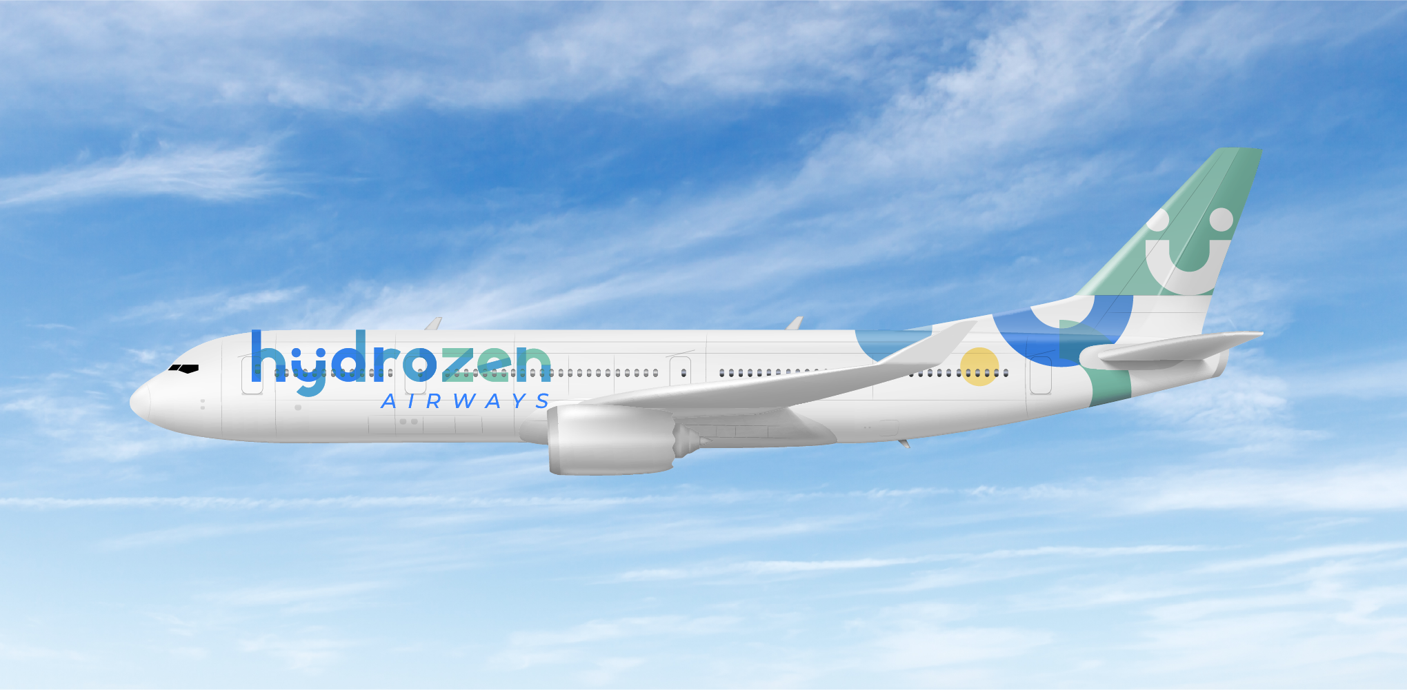
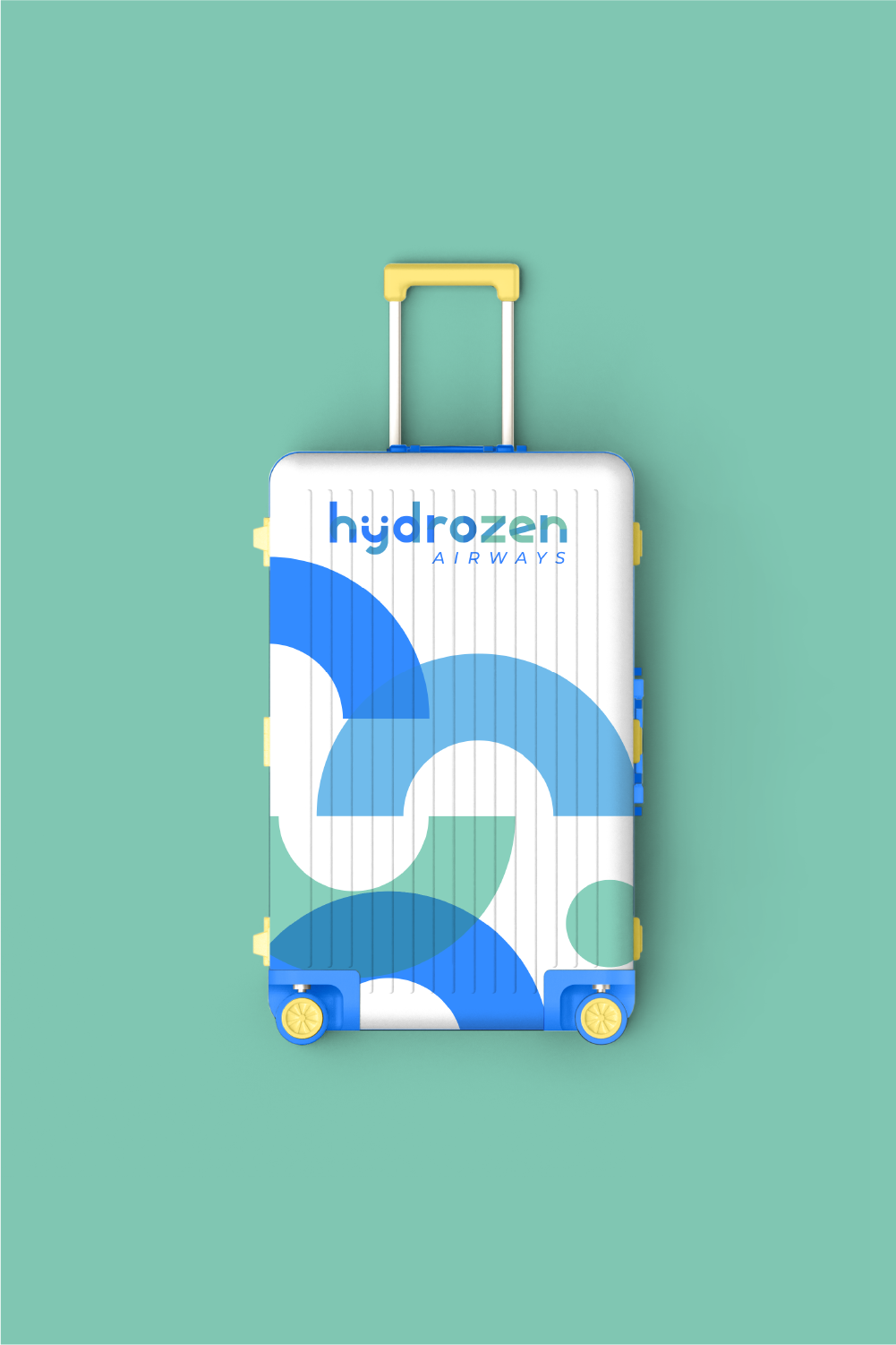
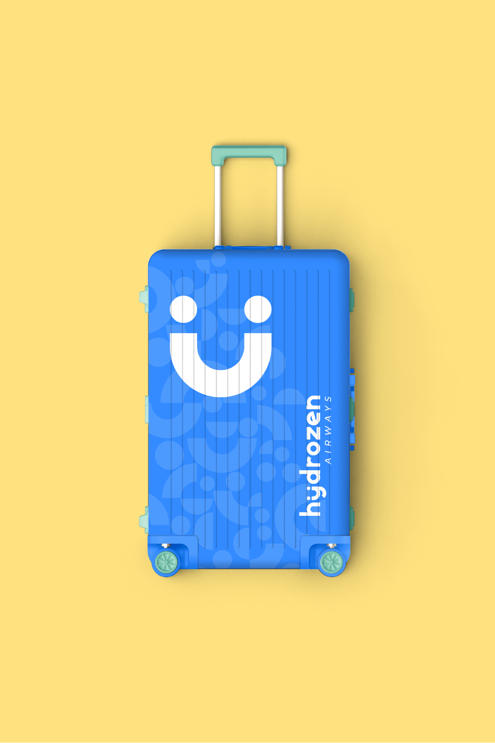
HYDROZEN AIRWAYS
In the context of this school project, we were tasked with imagining the visual identity of the first eco-friendly airline company.
The challenge of this project was to successfully blend the codes of air transportation, cutting-edge innovation, sustainable development, and customer service.
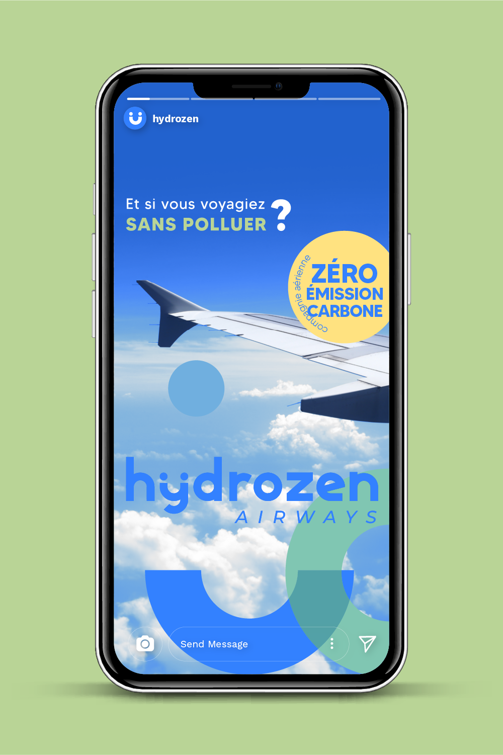
We had the freedom to choose the company's energy source: I opted for hydrogen. For its name, I chose the name HYDROZEN, combining "hydrogen,"
suggesting a green and planet-friendly fuel, with "ZEN," synonymous with serenity regarding our safety and peace of mind about our carbon footprint.
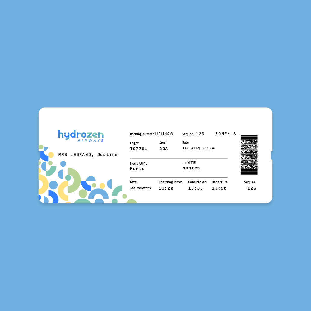
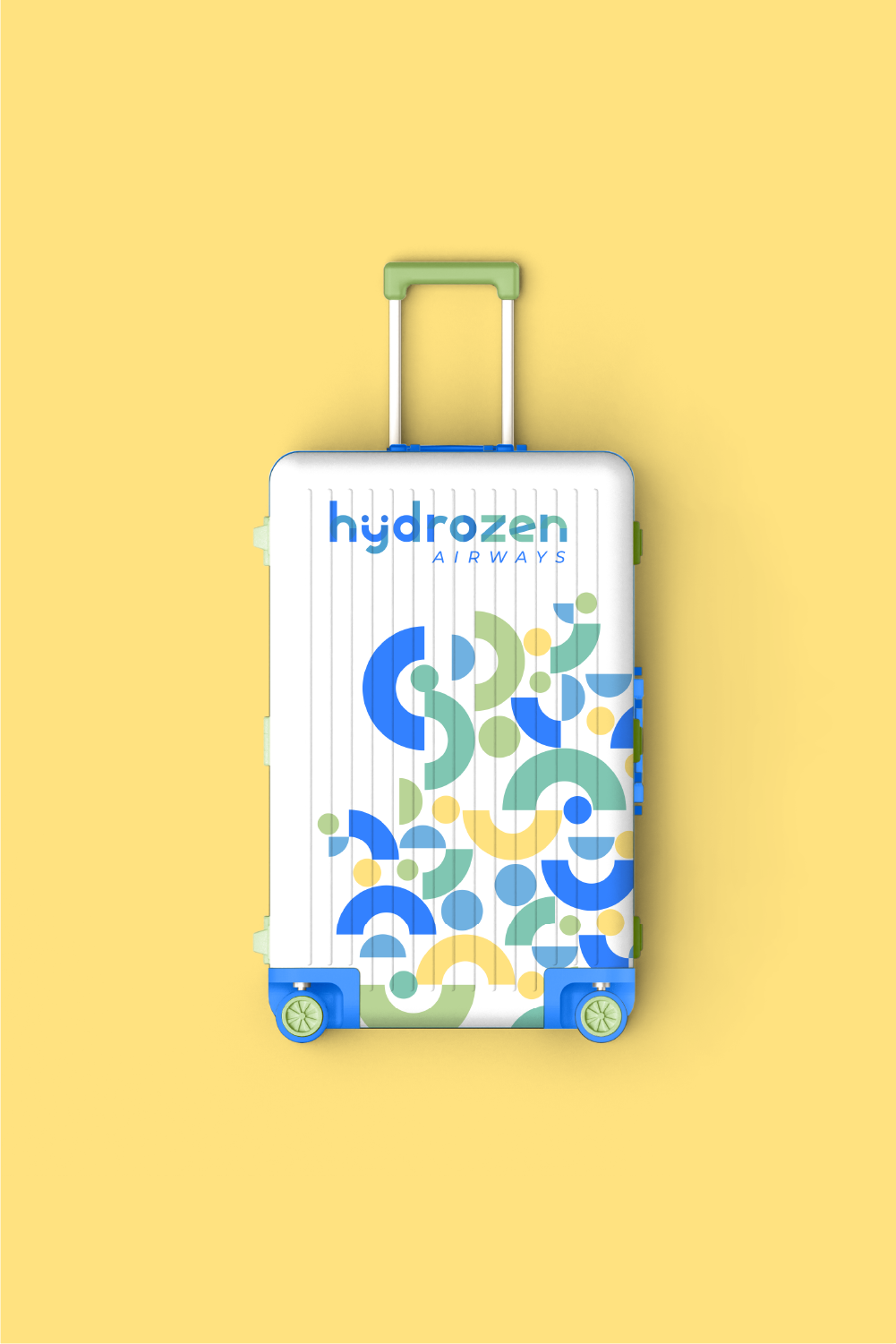
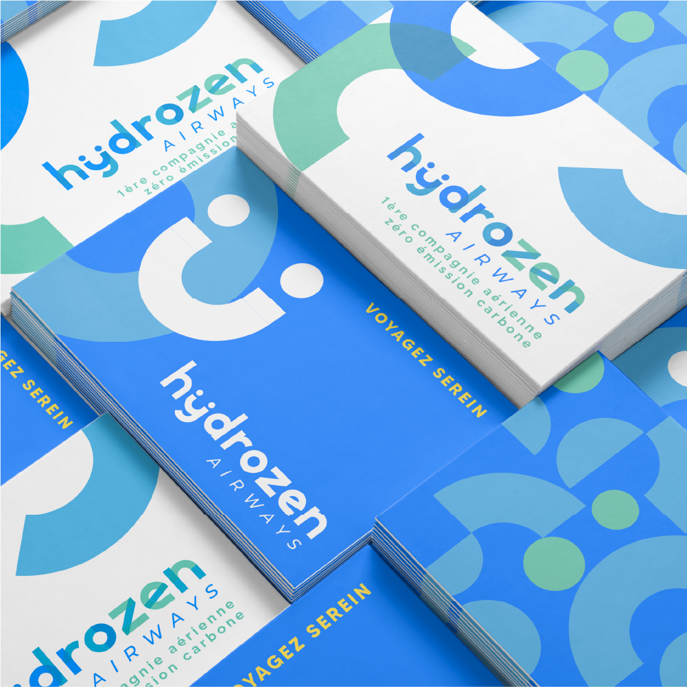
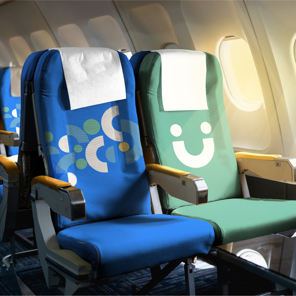
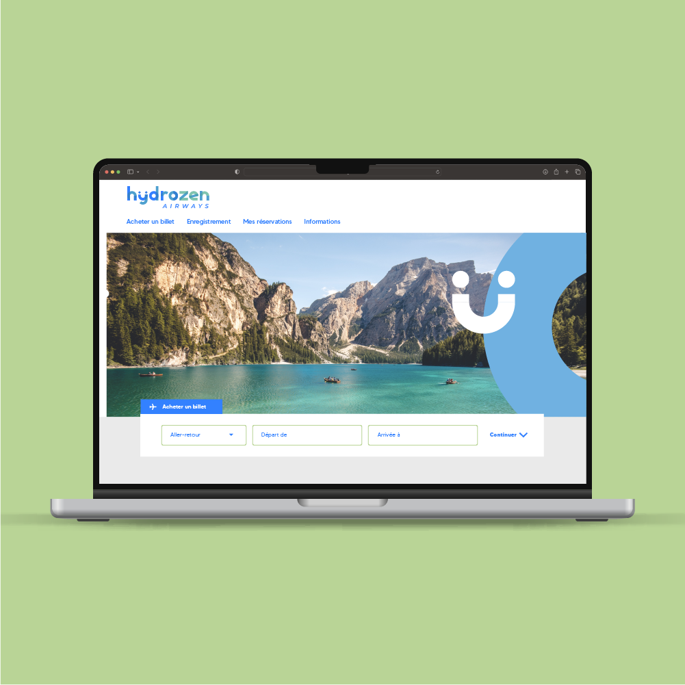
The visual identity of HYDROZEN is crafted through the use of geometric shapes, evoking the playful universe of games.
The smiley faces add a human and joyful dimension, a sense of pleasure.
These elements symbolize not only a positive impact on the planet but also an atmosphere of serenity and well-being during travels.
The chosen colors carry specific meanings: green evokes ecological commitment, yellow symbolizes positivity, joy, and energy,
while blue inspires trust, seriousness, security, and calmness.
By combining all these elements, the visual identity embodies the concept of an eco-friendly and welcoming airline,
where the pleasure of traveling goes hand in hand with environmental consciousness and passenger comfort.


 back
back