Brownswood Recordings is much more than just an independent label.
Embodying the ideals of a better music industry, the record house is deeply committed to a fairer and more egalitarian society, where everyone can achieve their full potential.
This rebranding proposal reflects this inclusive vision.
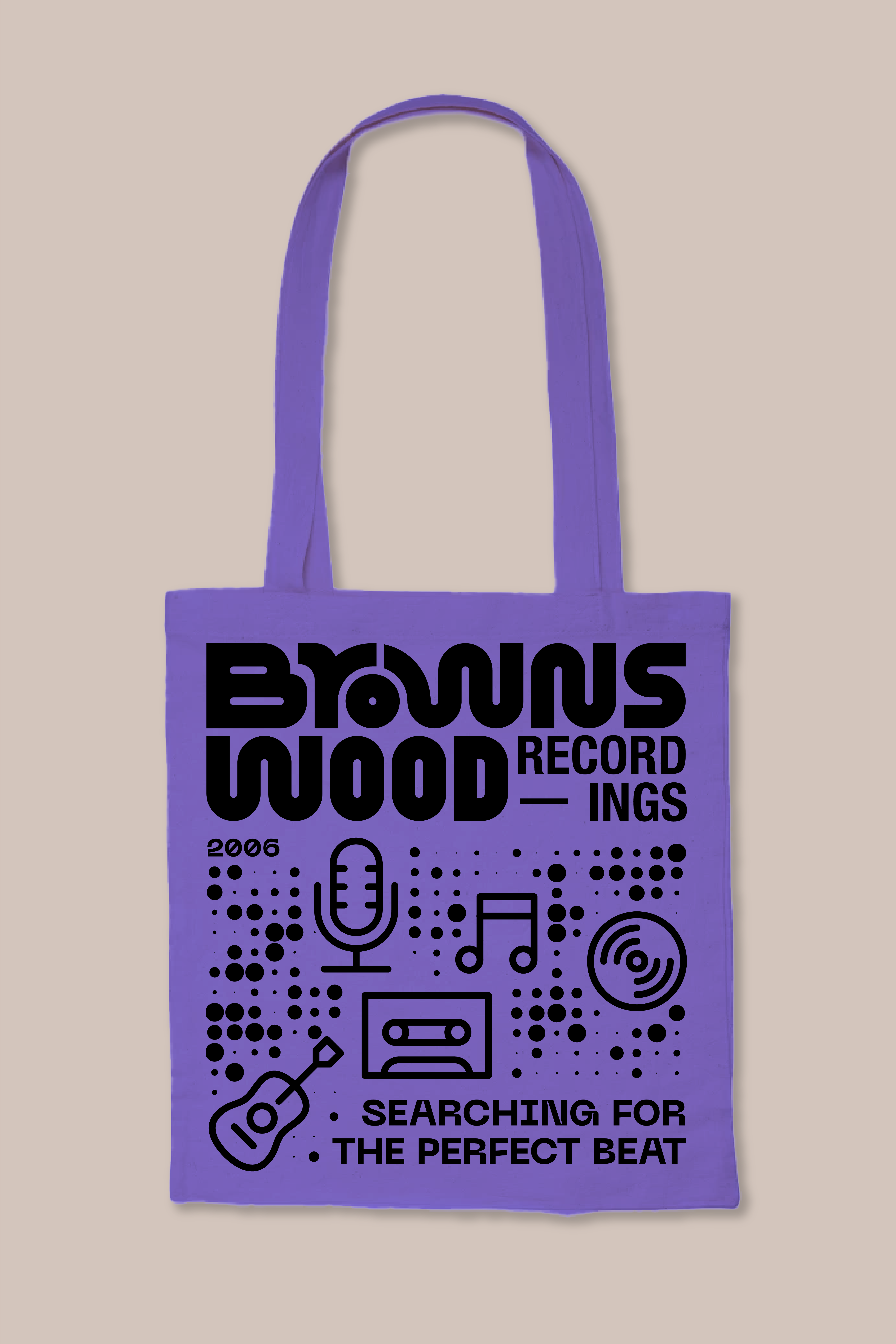
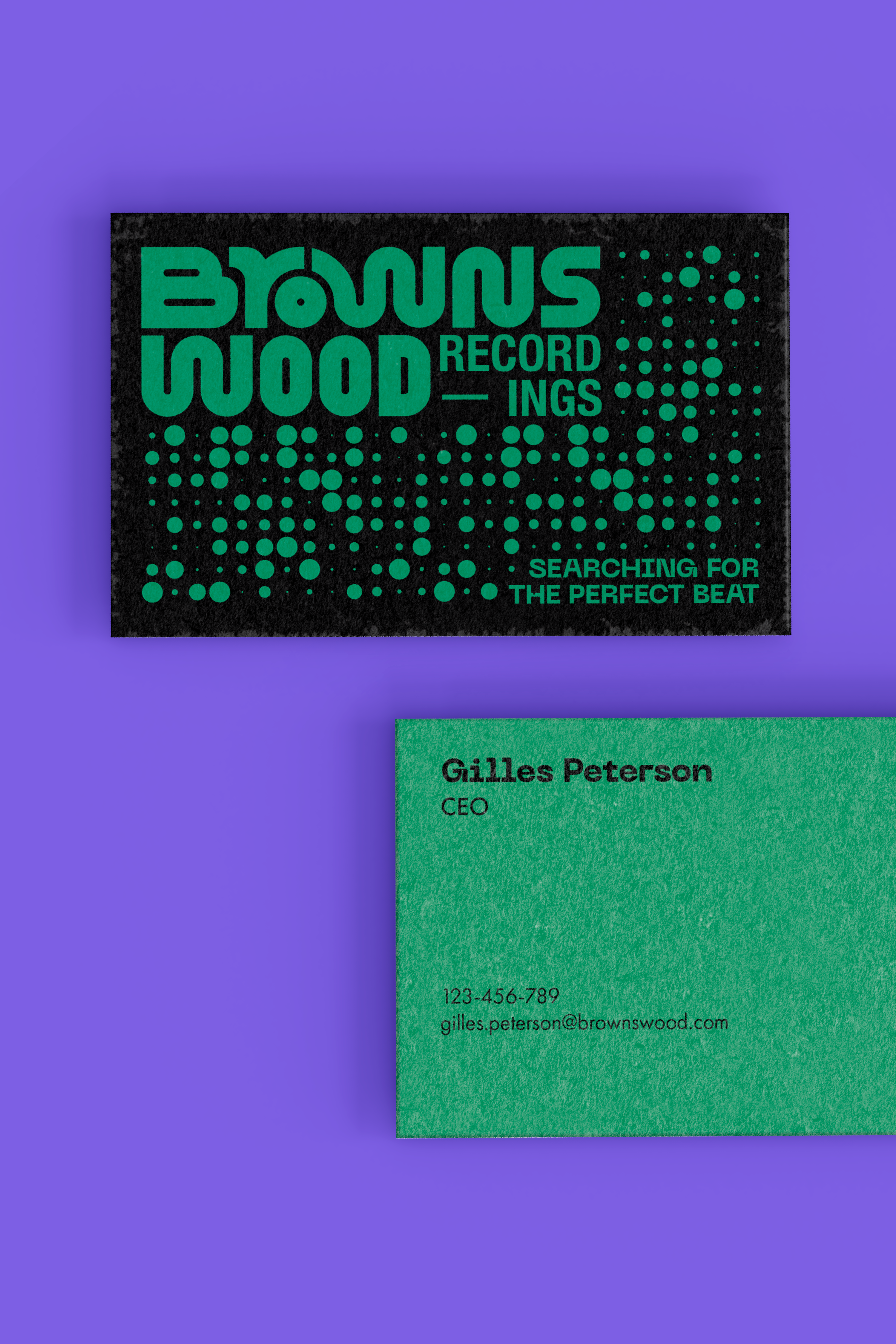
At first glance, the typographic characters of the logo, custom-made, vibrate like sound waves, harmoniously aligning with the rhythm of melody.
However, the logo doesn't just illustrate music. The letters R and W, forming a bridge over the O, embody connection, protection, and kindness.
The perfect circle of the O symbolizes inclusivity, creating a protective bubble, a sanctuary for all music lovers and creatives.
A graphic system composed of various geometric shapes paints a musical canvas of diverse genres where each note finds its place.
The broad color palette reflects the richness brought by diversity, which is dear to the label.
From orange to green, passing through purple, all shades blend harmoniously to celebrate each individual's uniqueness.
NOVEMBER 2023
Branding & Typography
School Project see more


 back
back